nextmv-v1.9.6
July 10, 2026What's Changed
- Addresses zizmor issues by @merschformann in #340
- Fix
BaseModelserialization and scenario test creation by @sebastian-quintero in #341 - Release v1.9.6 by @sebastian-quintero in #342
nextmv-v1.9.5
June 19, 2026What's Changed
- Improves formatting of CLI examples and changes an internal file to use internal convention (_) by @sebastian-quintero in #338
- Release v1.9.5 by @sebastian-quintero in #339
nextmv-v1.9.4
June 19, 2026What's Changed
- Fixes command order by @merschformann in #336
- Release v1.9.4 by @merschformann in #337
nextmv-v1.9.3
June 19, 2026What's Changed
- Supports more recent wheel targets by @merschformann in #334
- Add zizmor workflow for GitHub Actions security analysis by @merschformann in #314
- Release v1.9.3 by @merschformann in #335
nextmv-v1.9.2
June 18, 2026What's Changed
- Fixes pkce flow for accounts setup with 3rd party SSO providers by @merschformann in #332
- Release v1.9.2 by @merschformann in #333
nextmv-v1.9.1
June 16, 2026What's Changed
- Fixes system certs application for uv sub-processes by @merschformann in #330
- Release v1.9.1 by @merschformann in #331
nextmv-v1.9.0
June 12, 2026What's Changed
- Addresses dependabot issues by @merschformann in #319
- Clone a run - Cloud and Local - SDK and CLI by @sebastian-quintero in #318
- Fix content_format when submitting ensemble run with CLI by @sebastian-quintero in #320
- Bumps test timeout to stabilize binary smoke tests on windows by @merschformann in #322
- Fixes YAML parsing by removing explicit newline characters (\n) by @sebastian-quintero in #321
- Display nice error messages for HTTP errors in CLI and enable the
--debugoption in every command by @sebastian-quintero in #323 - Bumps uv dependencies to resolve dependabot issues by @merschformann in #324
- Upgrades lock files of templates by @merschformann in #325
- Move premium account confirmation on sync step in
nextmv initby @sebastian-quintero in #327 - Enable pagination for listing entities - SDK & CLI by @sebastian-quintero in #326
- Adds PKCE auth support and login command by @merschformann in #317
- Enables run comparison in the SDK and CLI, for both
cloudandlocalby @sebastian-quintero in #329 - Release v1.9.0 by @merschformann in #328
New dark mode for Nextmv Console
May 15, 2026
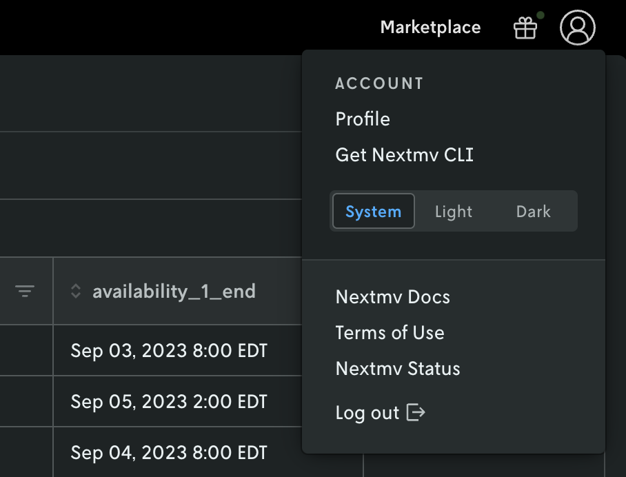
The Nextmv Console UI now has support for “dark mode.” If you have your system set to dark mode the UI will automatically recognize this and show a dark color theme. If your system is set to light mode then the UI remains the same.
 Screenshot of Nextmv Console in light mode.
 Screenshot of Nextmv Console in dark mode.
If you would like to set the Nextmv Console UI to use a different theme other than your system theme, you can adjust it by clicking on the profile link in the upper right and then selecting which theme you would like to use in the profile menu.
nextmv-v1.8.0
May 14, 2026What's Changed
- Upgrades dependencies in lock file by @merschformann in #304
- Improves logic for finding the manifest by @sebastian-quintero in #305
- Improves binary release performance by @merschformann in #306
- Add options to
nextmv manifest initby @sebastian-quintero in #307 - Moves to uv for python app dependency bundling by @merschformann in #303
- Pin GitHub Actions to commit SHAs by @merschformann in #308
- Avoid passing instance ID for ensemble runs by @sebastian-quintero in #309
- Allows empty ID for accept test, name for input set. Allow API key prompt on CLI config by @sebastian-quintero in #310
nextmv cloud app push: Activates version creation on instance create/update by @sebastian-quintero in #311- Add support for pyproject.toml by @sebastian-quintero in #312
- Improve messaging when the server might be unreachable by @sebastian-quintero in #313
- Caches Python dependencies for pushing, adds
nextmv cachecommand tree in CLI,cache.pymodule to SDK by @sebastian-quintero in #315 - Release v1.8.0 by @sebastian-quintero in #316
nextmv-v1.7.3
April 24, 2026What's Changed
- Fixes winget release workflow by @merschformann in #299
- Fixes bundled python interpreter version by @merschformann in #300
- Aims to improve encoding handling on windows by @merschformann in #301
- Release v1.7.3 by @merschformann in #302
nextmv-v1.7.2
April 23, 2026What's Changed
- Fixes order of operations bug for local runs by @merschformann in #297
- Fix stale 'Licensed Work' line in gurobipy / scikit-learn LICENSE files by @ryanjoneil in #292
- Adds support for Python execution for bundled / single binary CLI installations by @merschformann in #283
- Release v1.7.2 by @merschformann in #298
Changelog
April 10, 2026
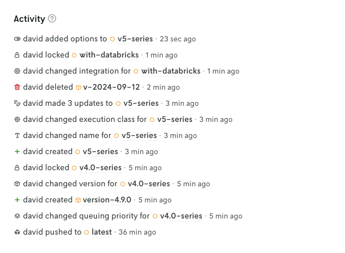
Updates to apps, instances, and versions are now being tracked and displayed in Console.
The changelog is displayed on the entity’s details view at the bottom of the page. The tracked changes include the user who made the change, what was changed, and a timestamp of when the change occured. In many cases the value of what changed is displayed as well.
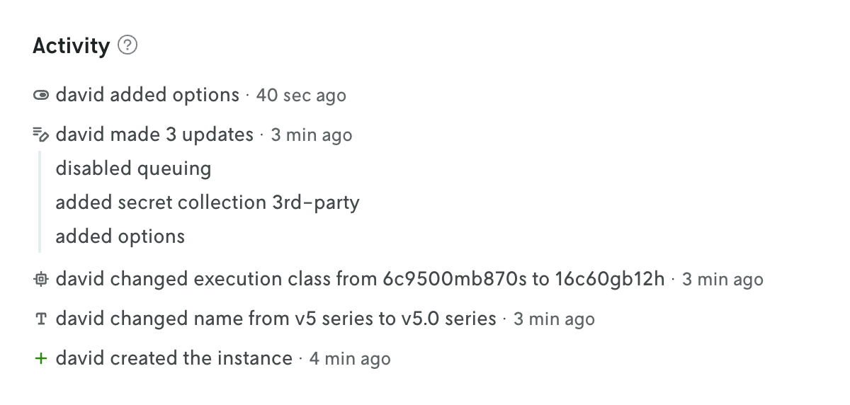
At the app level, the changes for all the different entities are collected and displayed on the App Overview page (including changes to the app iself, like when a default instance is set for the app). This is a great way to see the overall activity for an app without having to click into different views. Also, you can click on individual changelog entries in this app activity view to see the full changelog entry on the entity’s details view.
You can read more about what data is tracked and when tracking began on the Changlog docs page.
New create run view
January 13, 2026
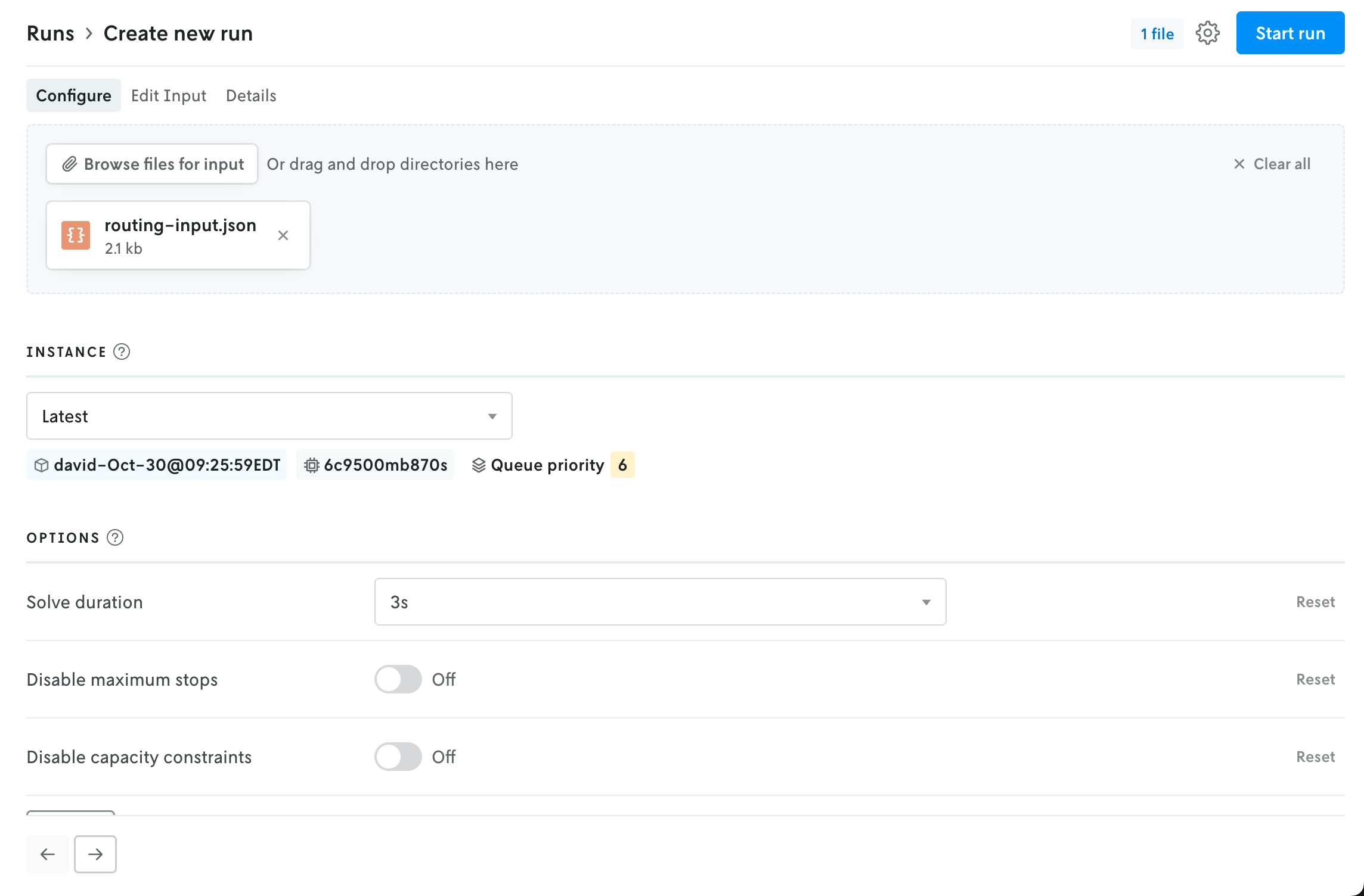
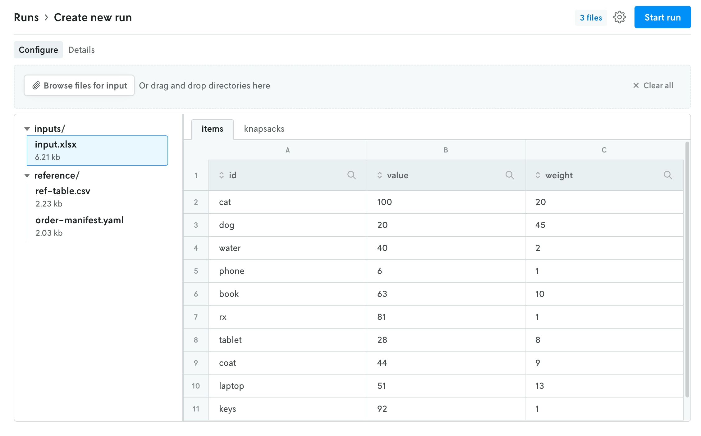
The create run view has been reorganized into a tabbed view interface to better reflect the flow for creating a run and make space for new features in the future.
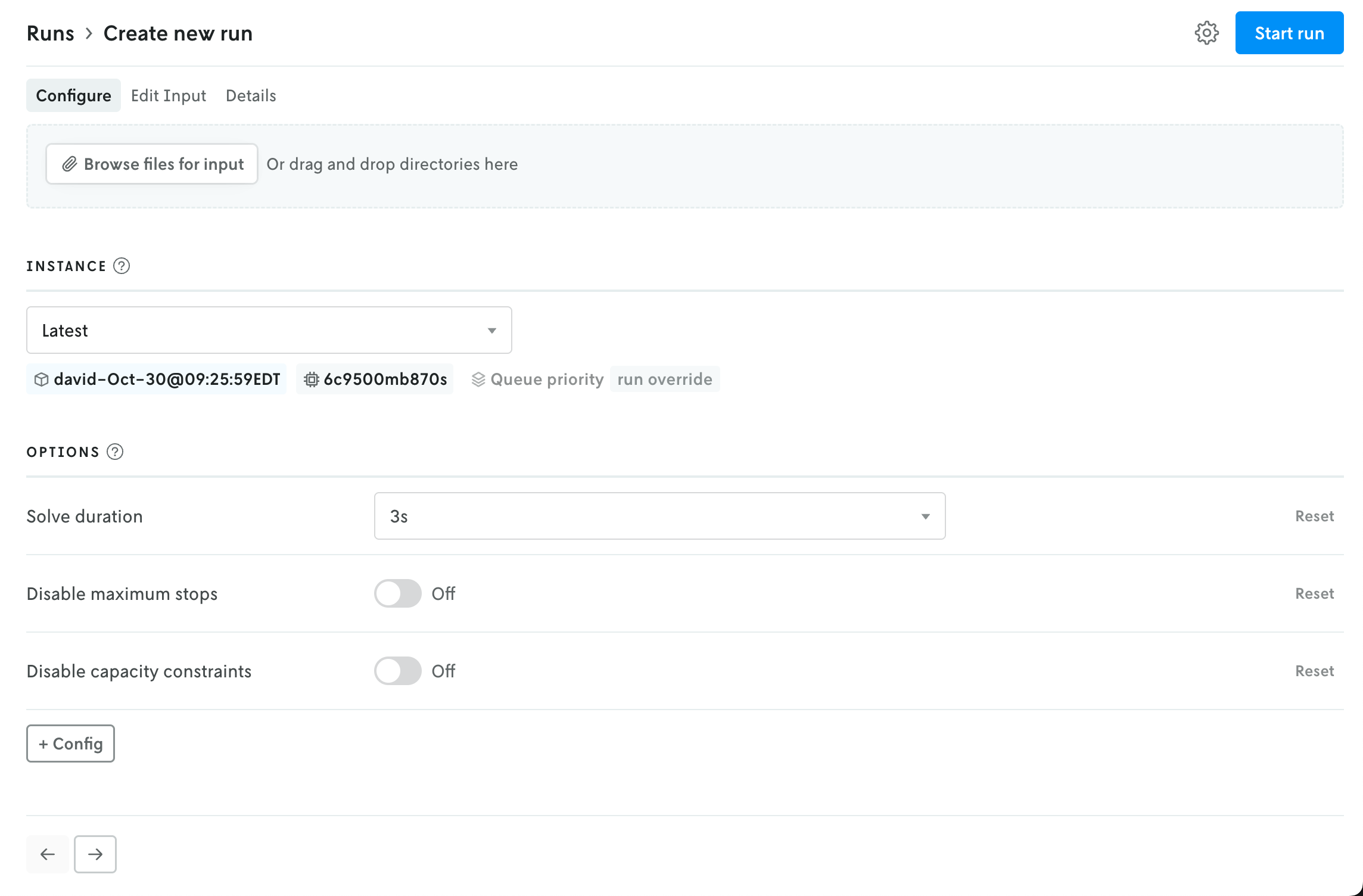
The initial view provides an uploader for the run input and an interface for selecting an instance (note that if your role is Operator then the UI for selecting an Instance is moved to the advanced settings menu). Depending on the format type for the app, the uploaded file(s) will be represented with either a file icon or shown in the multi-file viewer.
 How files appear for apps that use JSON format.
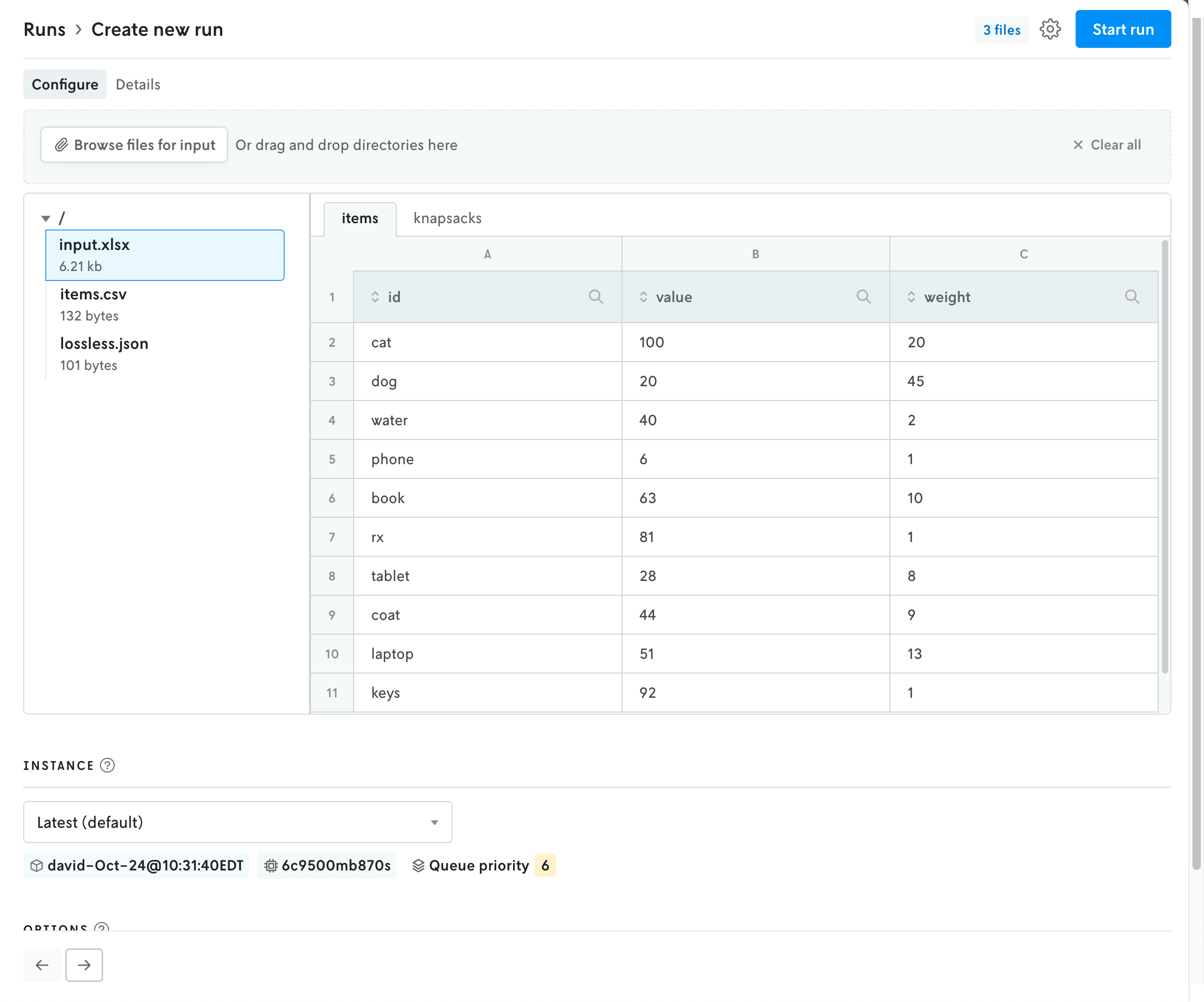 How files appear for apps that use multi-file format.
Updating the instance will refresh the available options for the run in the space below. Note that the Latest instance will be selected by default if no default instance is set for the app.
If the format type is JSON, the contents of the uploaded file — if they are below the render threshold of 10 MB — will be loaded into the JSON editor in the edit input view. You can click on the Edit Input tab to view the contents of the uploaded file. If you would like to edit the contents, and use this edited input for the run rather than the uploaded file, you can toggle the “Use edited input for run” option. (You can toggle this back off as well, and the run will use the original uploaded file for input.)
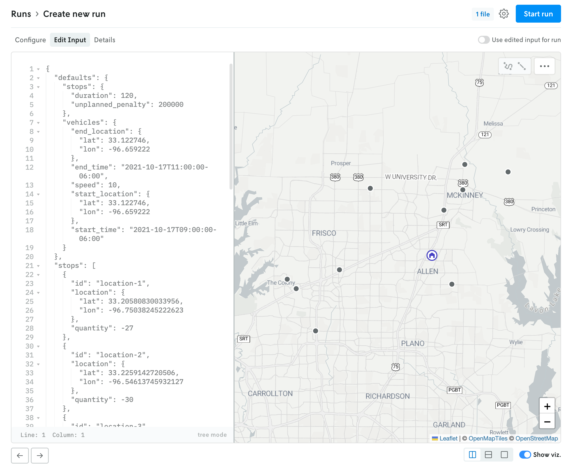 JSON run with use input editor for run toggled off.
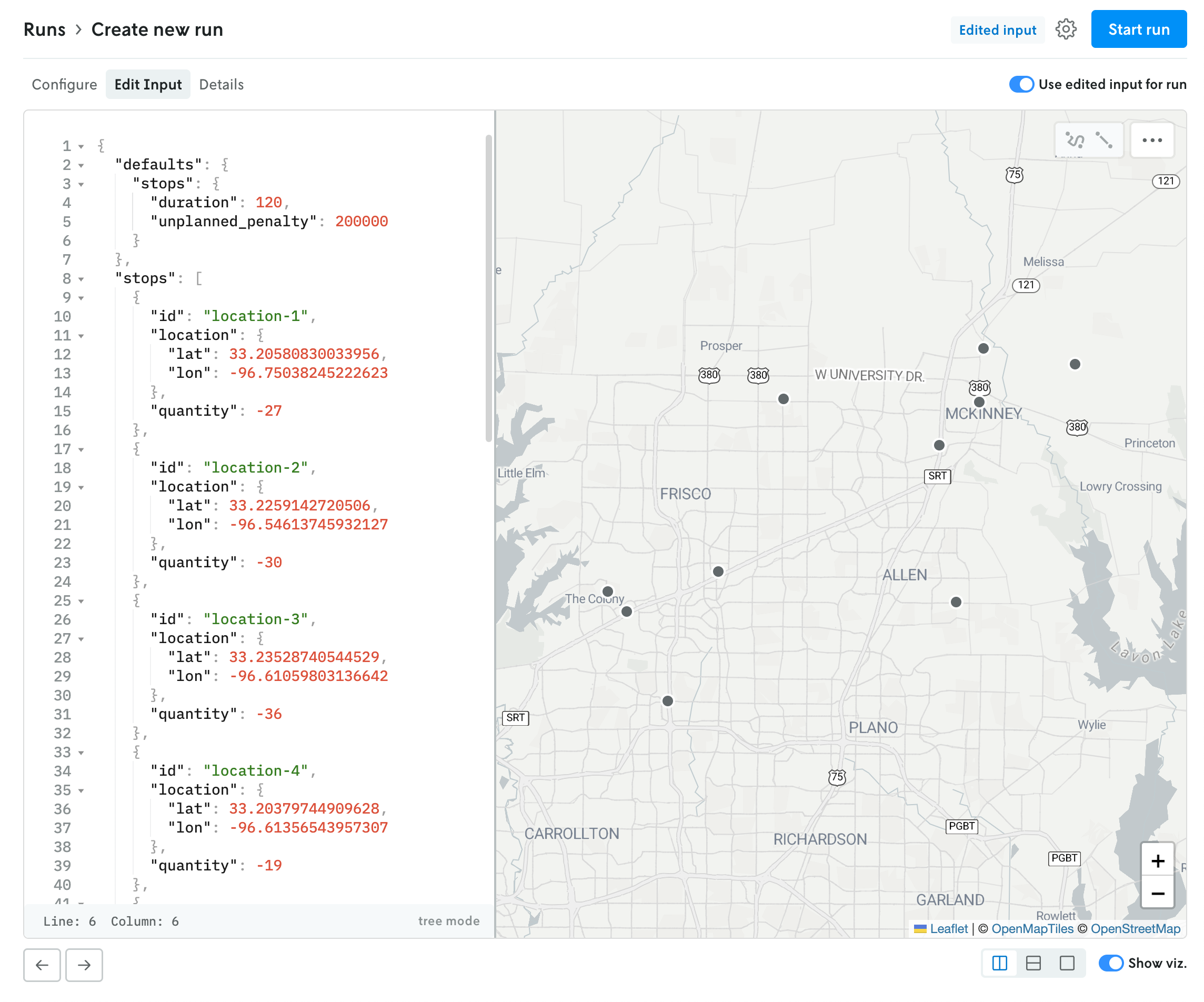 JSON run with use input editor for run toggled on.
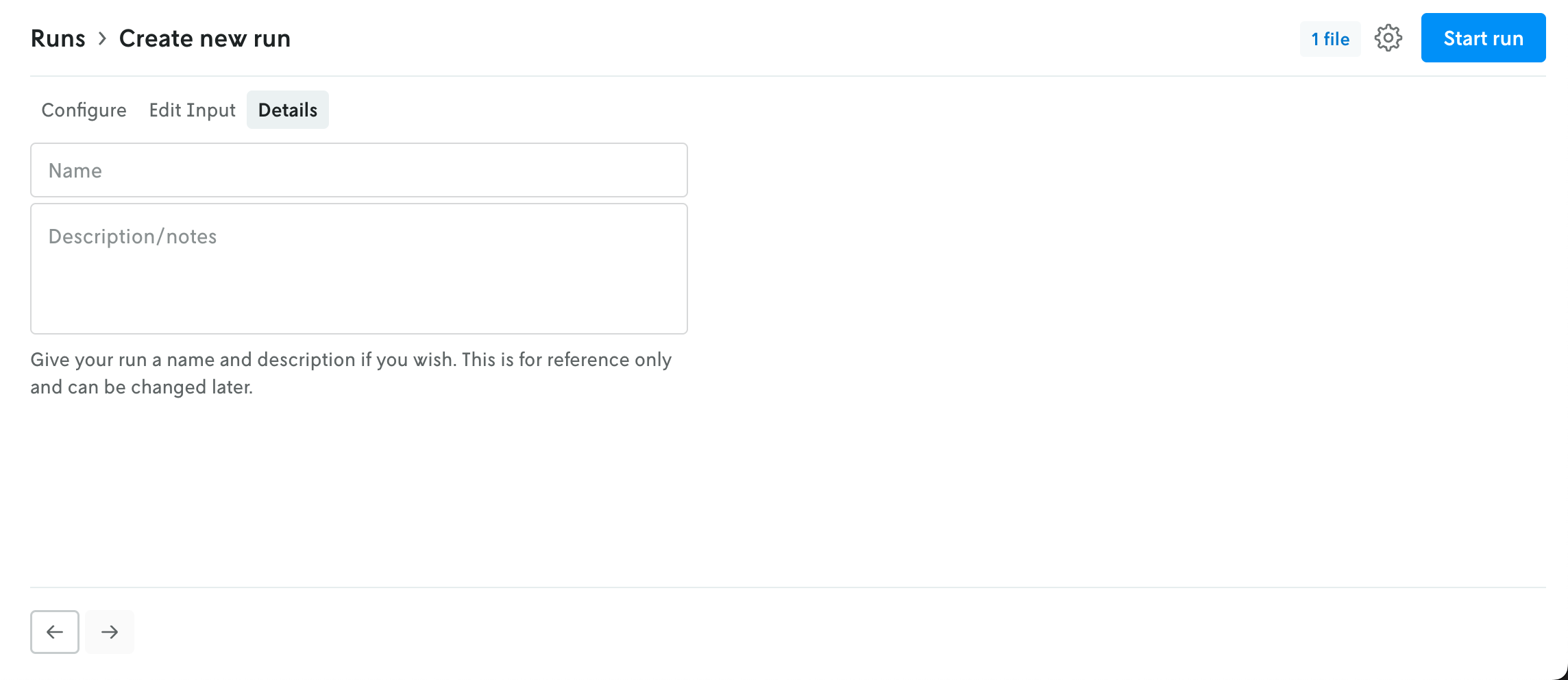
The Details tab allows you to name your run and add a description if you would like. Both of these fields are optional.
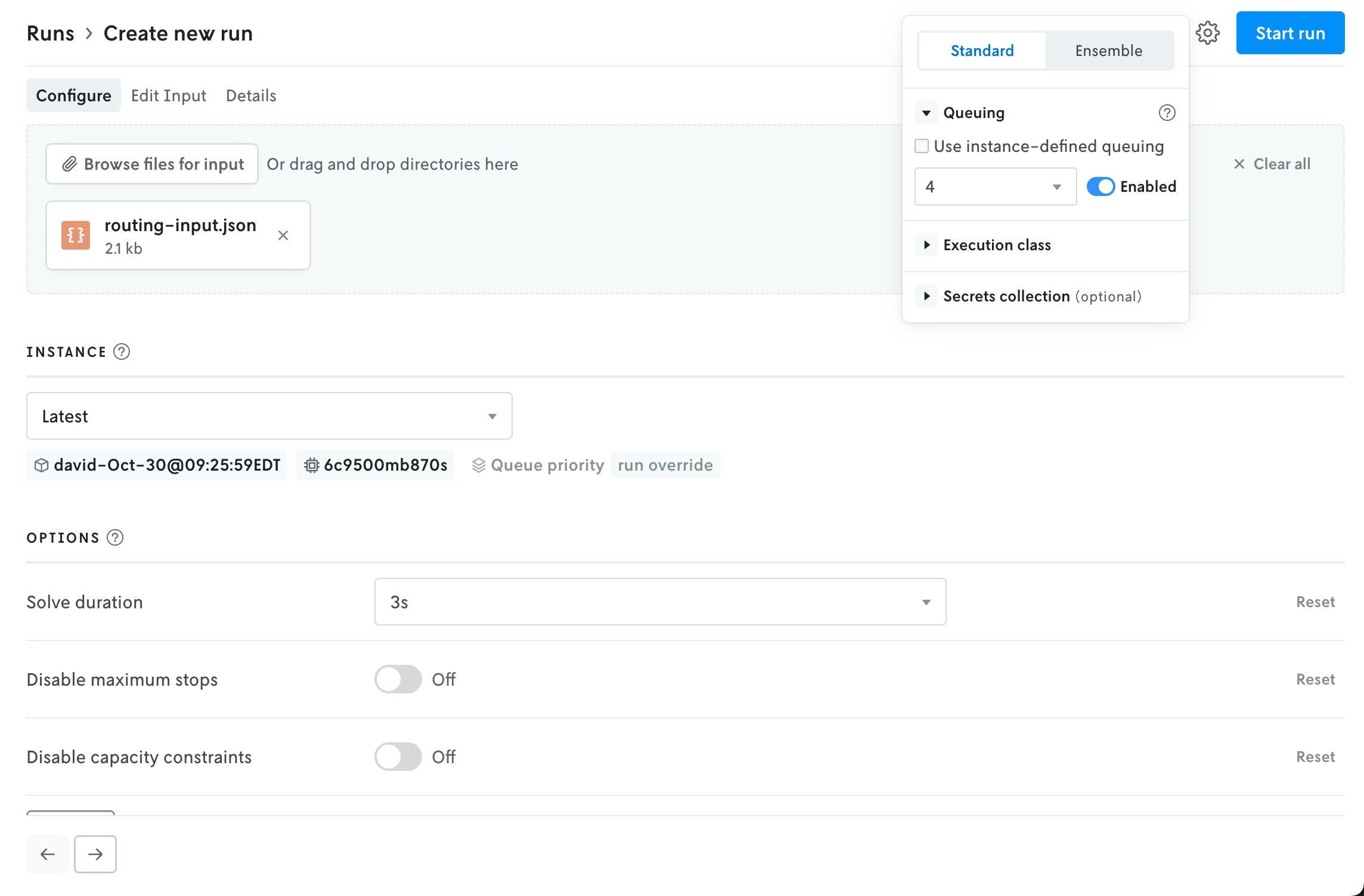
In the upper right, an advanced menu collects the rest of the run settings into a single dropdown. This menu contains the UI for adjusting the run queue settings, selecting a specific execution class for the run, and assigning a secrect collection to the run. Note that any run-level setting will override an instance-level setting (this is reflected in the UI as well).
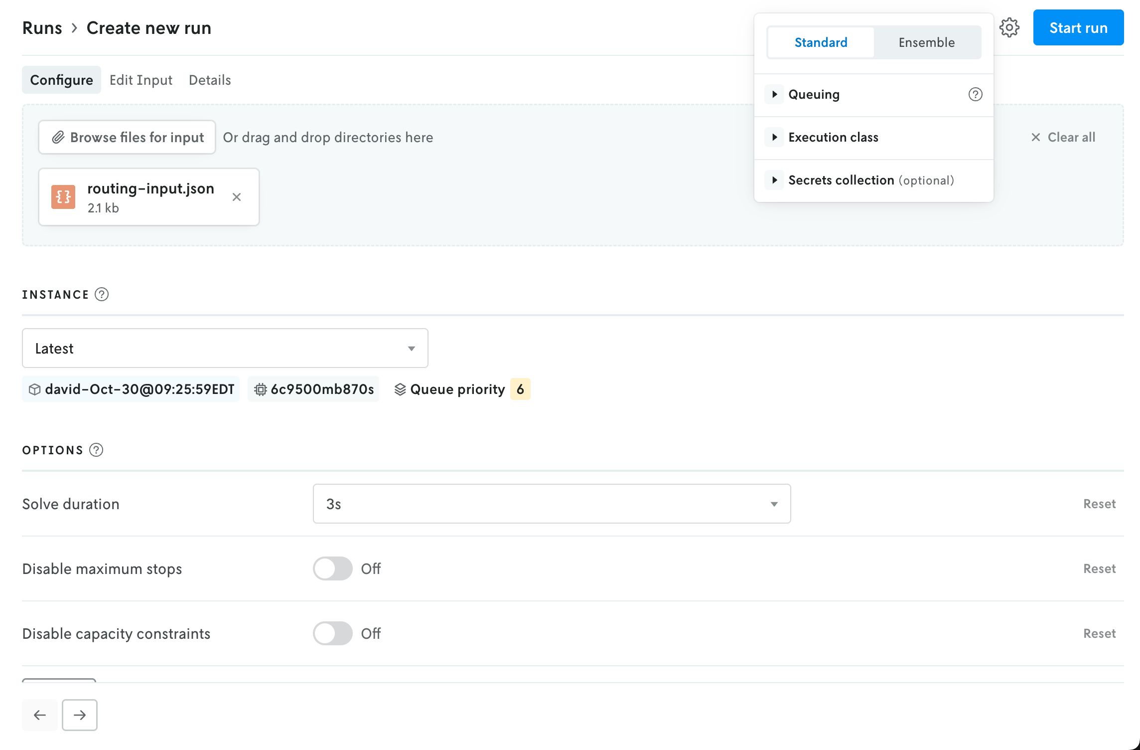
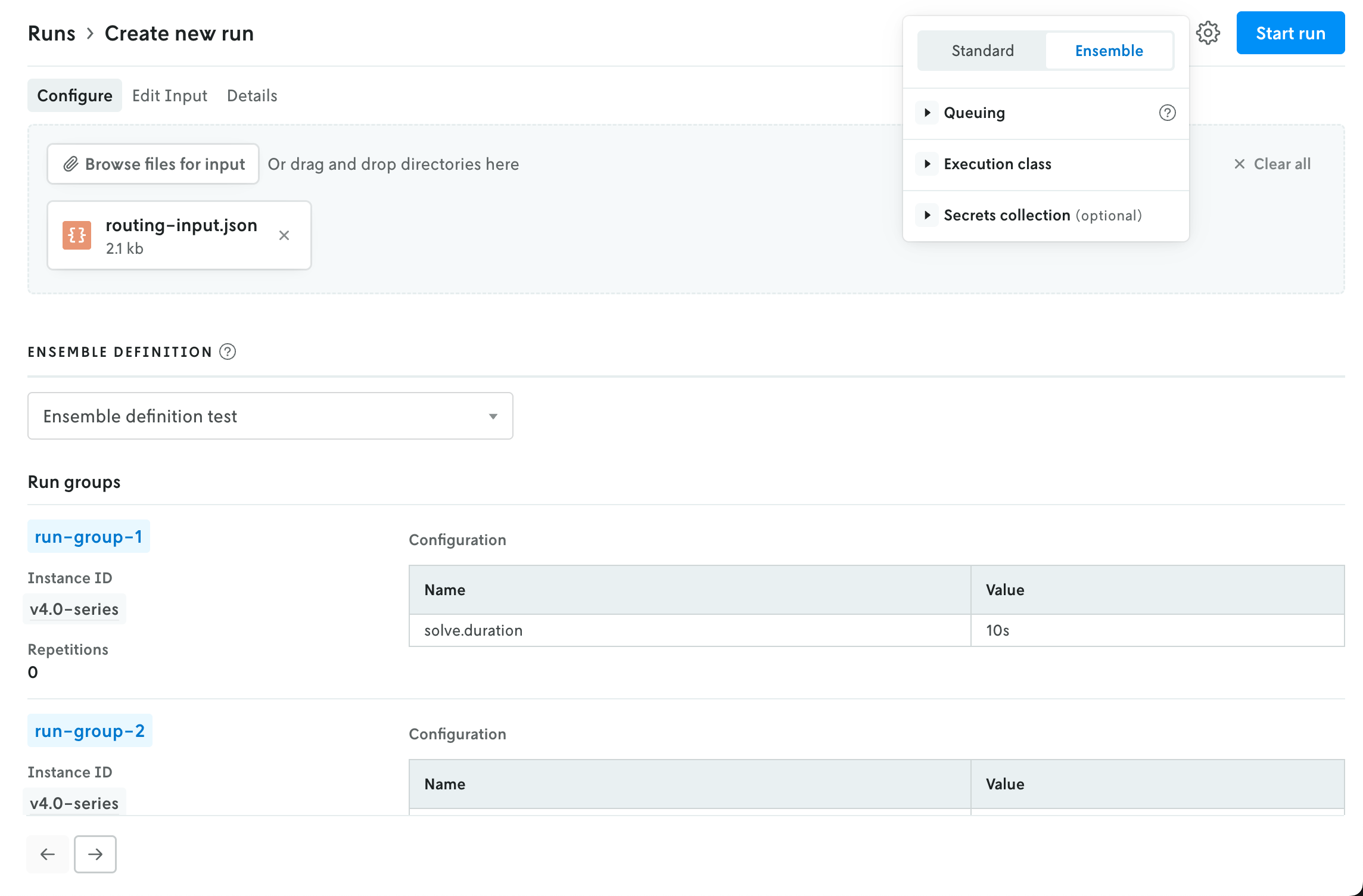
The advanced menu is also where you select the run type. Standard is the default setting; if you select Ensemble then the UI in the main view will be adjusted to show the options for creating an ensemble run (the instance selector is replaced with a dropdown select menu for ensemble definitions).
Multi-file viewer
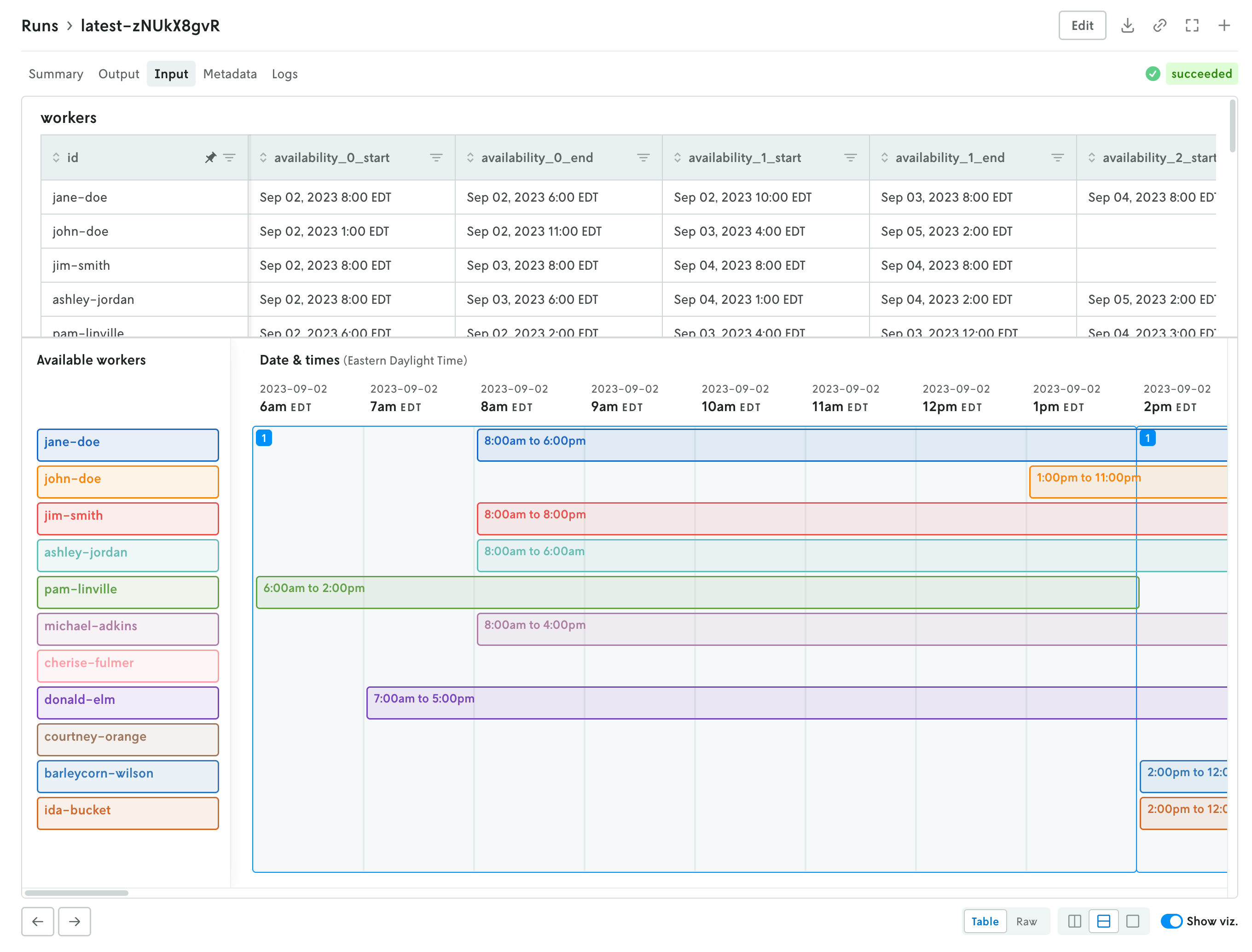
December 4, 2025
Console has a new multi-file viewer that allows you to browse the contents of multi-file input and output. You can view CSV and JSON files in table views or raw views, and you can view XLSX files as well (powered by SheetJS Community Edition). You can view the contents of other types of files as well (.txt, .yaml, etc.).
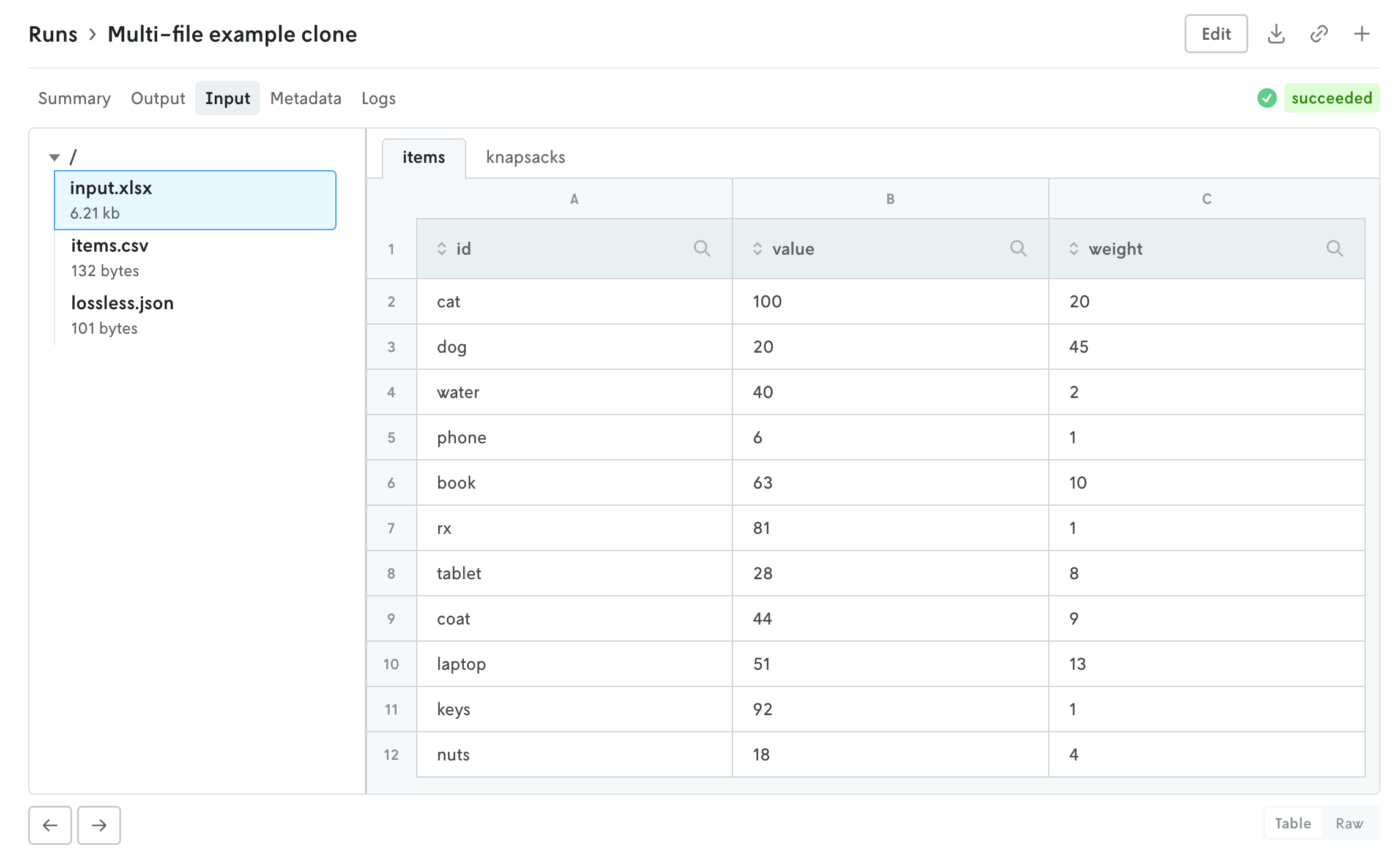
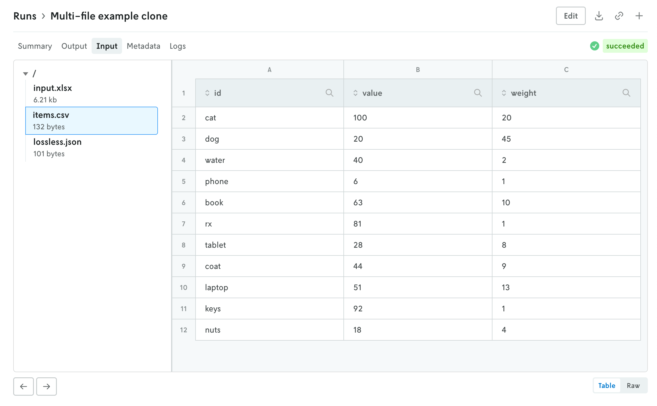
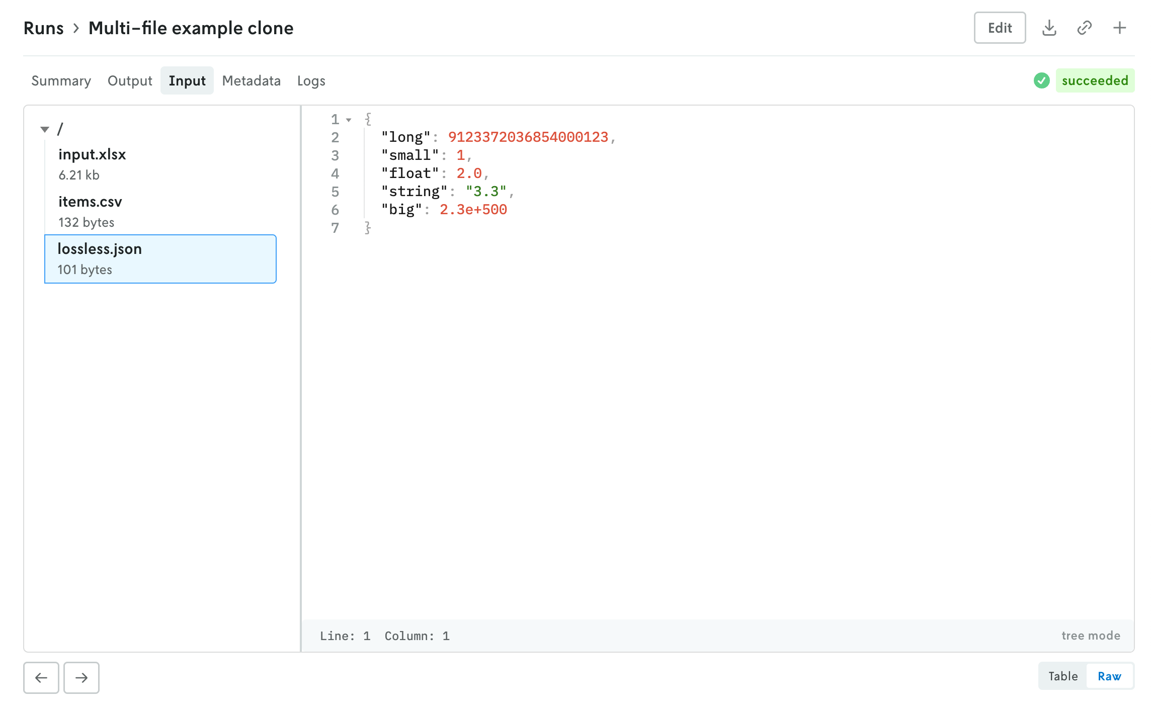
The left side is the file browser and the right side displays the contents of the file. You can also browse the contents of a multi-file run input on the create run view before you make the run. Note that for multi-file runs you can drag and drop files and directories and the directory structure will be preserved.
The file size threshold for viewing individual files within a multi-file run in Console is 10 MB. Any file over 10 MB will display an interface for downloading the individual file. You can also download the entire input or output file using the standard action buttons in the header of the run details view.
Custom run output visualizations
November 25, 2025
Using custom run visuals, you can now set a custom visual for the run output tab. Before, the output would only have a visual if the output matched set schemas for routing or scheduling apps, now you can set a custom output visual for any type of app.
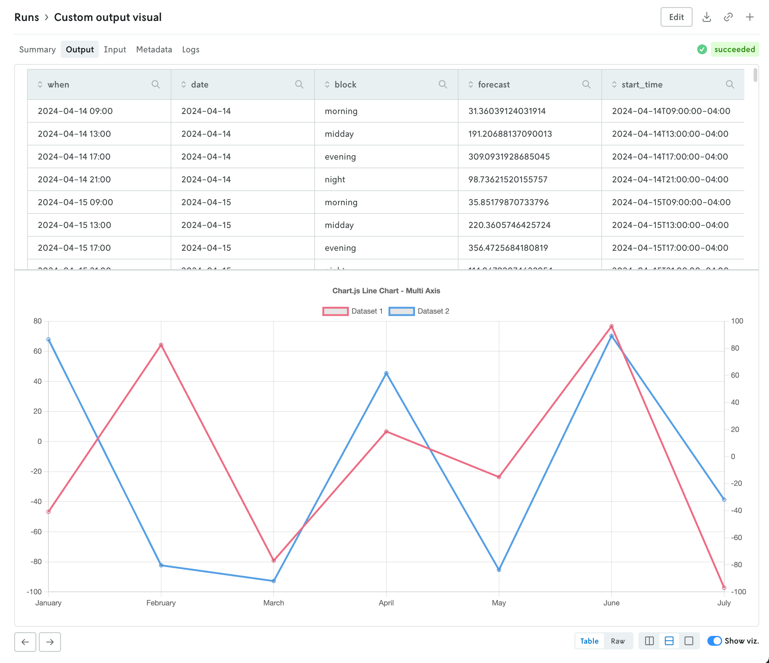
To assign a custom run visual to the output tab, set the type value to be output-visual:
Your custom visual will have the same controls as the standard routing and scheduling visualizations so you can enable split screen views (or single views) on the data and corresponding visualization. Note that custom visuals will override any standard output visualizations.
Add custom visuals to the run summary view
November 19, 2025
You can now set specific custom run visuals to appear on the summary view of the run details view. They will appear in a top row above the metrics and run options summary tables.
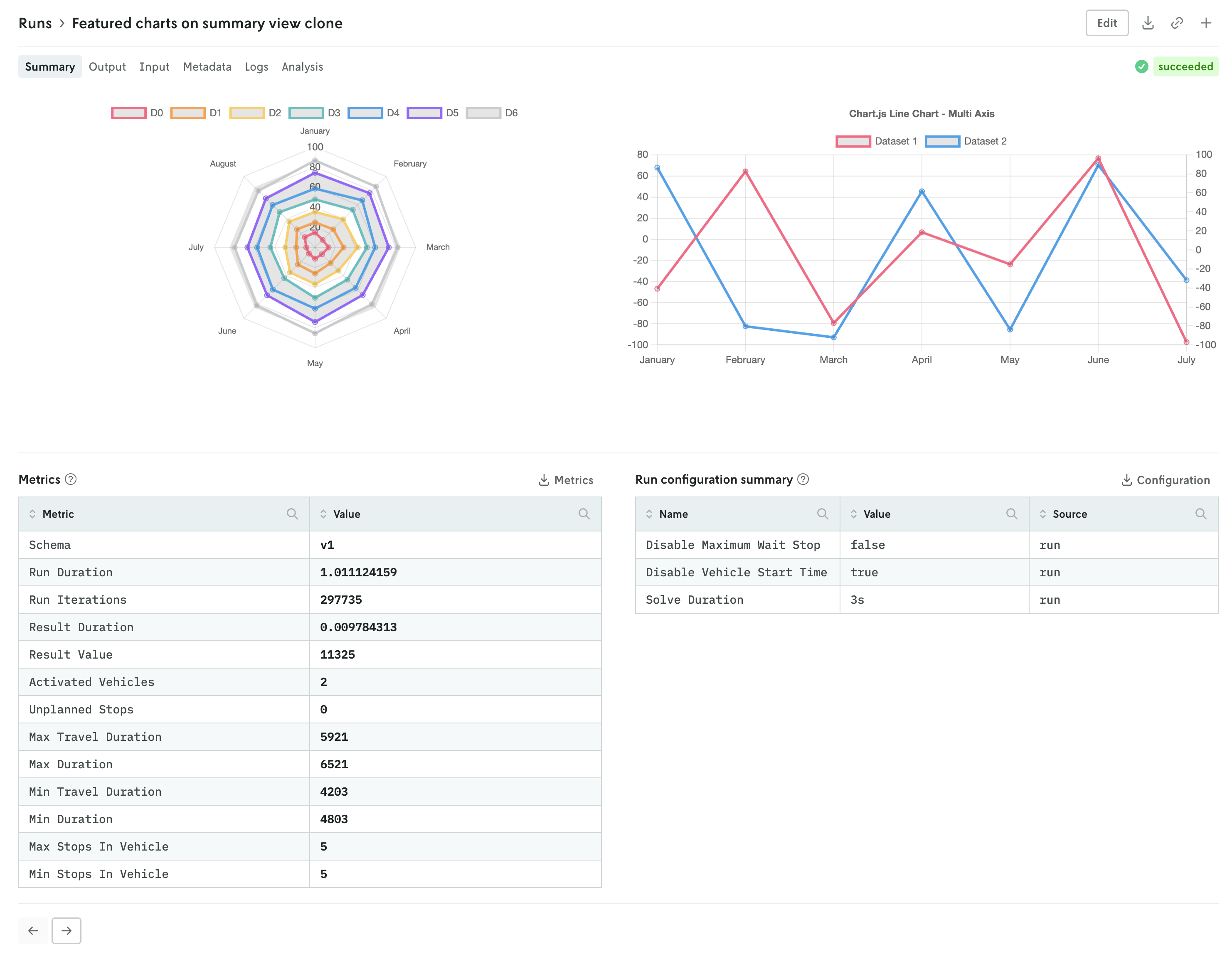
The custom visuals that appear on the summary view follow the same schema with the addition of a slot property. First, you must specify that the custom run visual should appear in the summary view with the "type": "summary-tab" designation, then you define the order with the slot property. An example of specifying a single custom visual is shown below:
You can specify up to three custom visuals for the run summary view. The slot property can have the values 1, 2, or 3:
1specifies that the visual will be on the left,2specifies that the visual will be on the right if two, in the middle if three, and3specifies that the visual will be on the right.
Note that the visuals will automatically adjust for more narrow screens (e.g. mobile devices).
Updated run details views
November 17, 2025
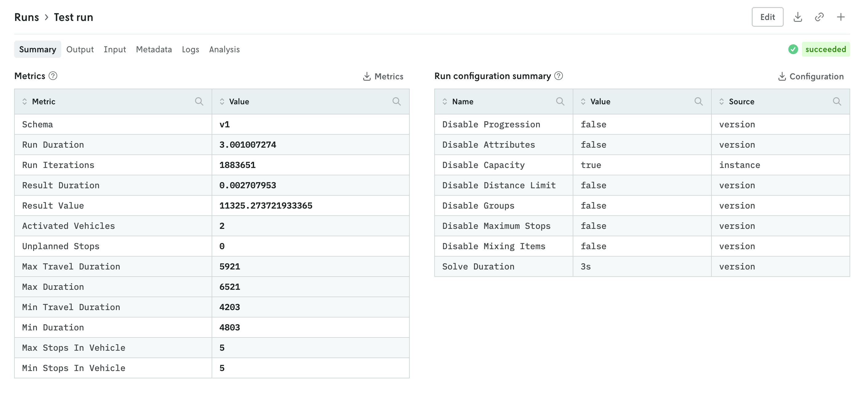
The details view for runs was updated to better align with the data returned and viewing patterns. Summary tables of run metrics and options used are separated into their own view called Summary which is the default landing view when you click on a run. If you are documenting the objective function in your output, then a table summarizing the objective function for the run will be displayed as well.
You can further enhance the summary view by adding your own visuals. See the release note for adding custom visuals to the summary tab for more information.
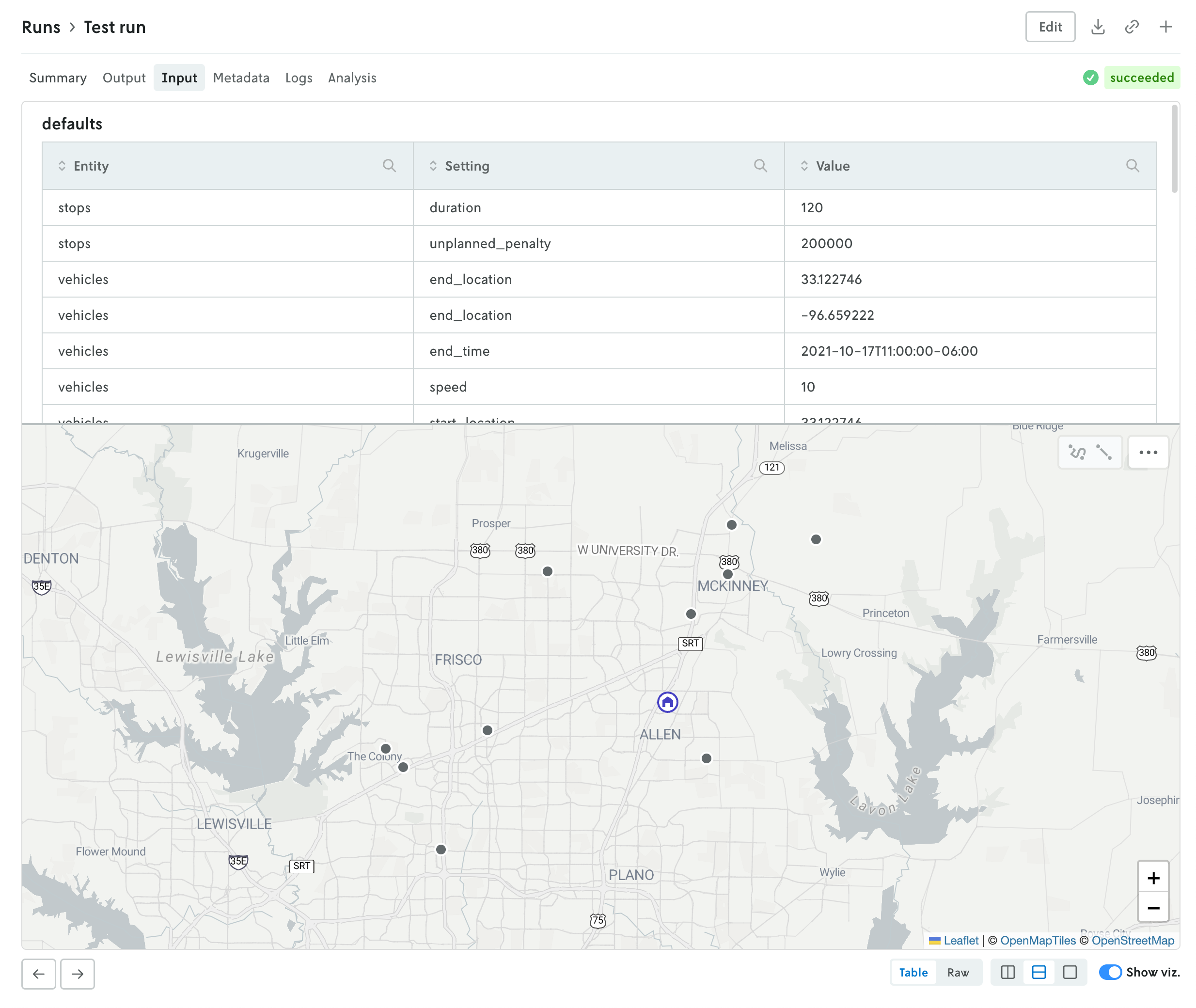
The input and output tabs have been updated with more intuitive controls for managing table and raw data views and visualizations if they exist as well.
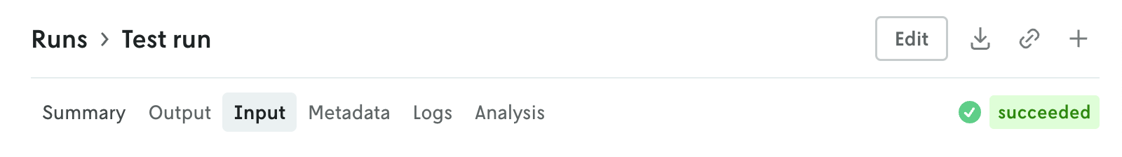
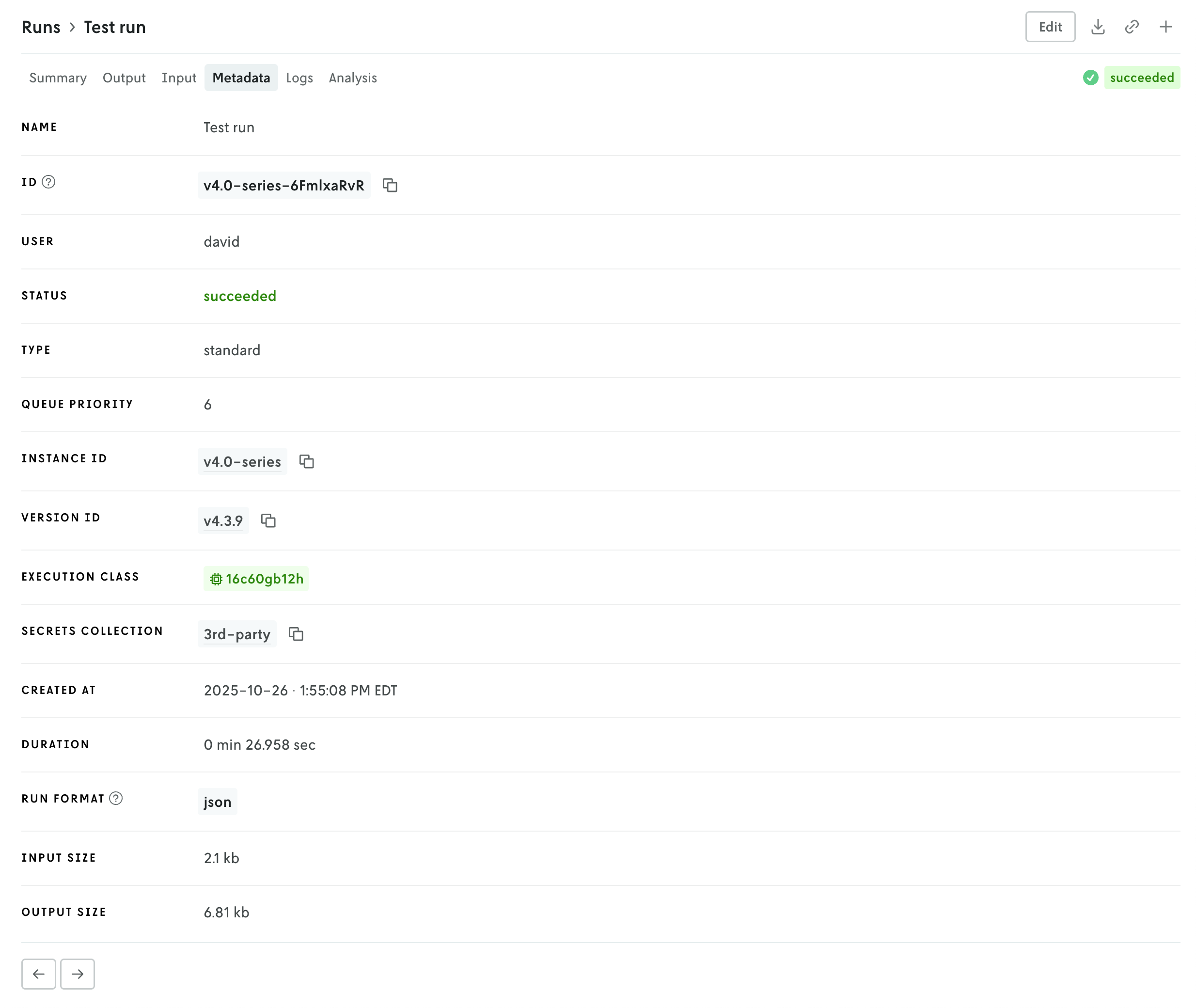
Additional views include a new Metadata view which displays a variety of information related to the run like duration, type, queuing, which version and instance were used, and so forth. The run status has been pulled out of the metadata view and displayed in the header so you can easily view the status of a run no matter which tab view is active.
Then there is a tab for viewing run logs, ensemble analysis details (if it’s an ensemble run), and series data charts if they exist (in the Analysis tab). You can navigate the different views by clicking the tabs in the header or you can use the left and right arrows in the page footer to navigate between the views.
And you can continue to edit the run, download the full input and output files, share views, or create a new run or clone the run you’re viewing using the action buttons in the header.